Bar Charts in Geography
What is a bar chart?
Bar charts are one of the simplest forms of displaying data. Each bar is the same width, but the height depends on the data being plotted. The bars should be drawn an equal distance apart.
When is using a bar chart appropriate?
Bar charts are ideal for presenting discrete data. Discrete data is a special kind of data because each value is separate and different. For example, the results of a traffic count should be presented on a bar graph because each value is different e.g. cars, buses, motorbikes etc.
Creating a bar chart
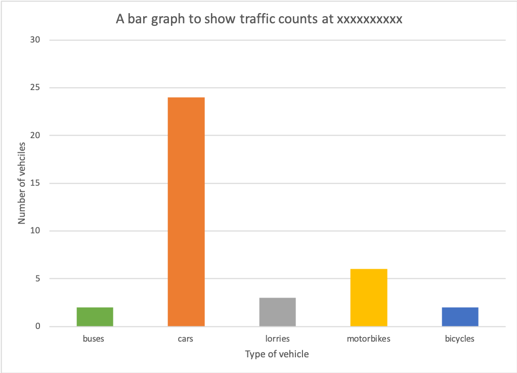
Creating a bar chart is relatively simple. In this example, we are going to produce a bar chart to show the results of a traffic count. Students have collected raw data that shows the type and number of vehicles that pass them within 15 minutes:
- buses – 2
- cars- 24
- lorries – 3
- motorbikes – 6
- bicycles- 2
Step 1 – Decide on the scale of the X-axis
Decide on an appropriate scale on the X-axis for the bars. The bars should be the same width, as should the space between the bars.
Step 2 – Decide on the scale of the Y-axis
Decide on a suitable scale for the Y-axis for the number of vehicles. The scale should be spaced evenly and allow for the highest number in the data set to be included.
Step 3 – Create the bar chart
Accurately draw the bars for each piece of data. As the data is discrete, each bar should be shaded in a different colour.
Step 4 – Finish your graph
Include a title and label each axis.

Reading a bar chart
To read a bar chart, read along the x-axis (bottom) to find the bar you want. Go to the top of the bar and read across to the scale on the y-axis to work out the value. Using a ruler can help with this.
Create your own bar chart
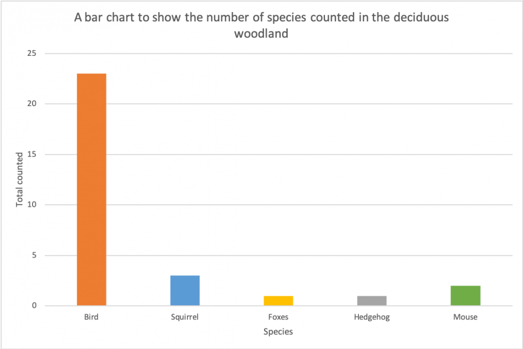
The data below shows the results of a fauna (animal) survey in a woodland ecosystem. Create a bar chart to present the data.
Bird = 23
Squirrel = 3
Foxes = 1
Hedgehog = 1
Mouse = 2
Download a bar chart template
Of course, bar charts are much easier to create using spreadsheet software such as Excel and Google Sheets. Download an example using the data shown above.
Data Presentation Techniques in Geography
Use the images below to explore related GeoTopics.


