Compound Line Graphs in Geography
What is a compound line graph?
A compound line graph is a development on the simple line graph. They show layers of data and allow you to see the proportion that makes the total.
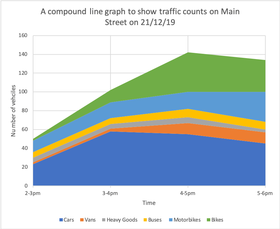
On a compound line graph, the differences between the points on adjacent lines give the actual values. To show this, the areas between the lines are usually shaded or coloured and there is an accompanying key. This is illustrated in the compound line graph below.
When is using a compound line graph appropriate?
If information can be subdivided into two (or more) types of data, and contains continuous data, a compound line graph can be drawn.
Creating a compound line graph
Step 1 – Draw the axis
The independent variable e.g. time, should be plotted along the x-axis (horizontal). The dependent variables, which can be percentages or raw values should be plotted along the y-axis (vertical). Make sure you decide on an appropriate scale.
Step 2 – Plot the data
Plot the data for the first entry. Join the points using a ruler. Then, shade the area covered this entry. Remember to include a key.
Step 3 – Finish, shade and label
Add the next data entry. Remember to add the value on top of the previous entry. Repeat this for all other data entries. Remember to shade each entry a different colour and add it to the key. Complete your graph by adding a title and labelling each axis.
Reading a compound line graph
The key to successfully reading a compound line graph is remembering to only calculate the value of the shaded area you are extracting data for.
Create your own compound graph
The data below shows the results of traffic counts on Main Street between 2 and 6pm. Produce a compound line graph to present the results.

Download a compound line graph template
Of course, compound line graphs are much easier to create using spreadsheet software such as Excel and Google Sheets. Download an example using the data shown above.
Data Presentation Techniques in Geography
Use the images below to explore related GeoTopics.


