Divided bar charts in geography
What is a divided bar chart?
In divided bar charts, the columns are subdivided based on the information being displayed. Divided bar charts are used to show the frequency in several categories, like ordinary bar charts. It is a type of compound bar chart. But unlike ordinary bar charts, each category is subdivided.
When is using a divided bar chart appropriate?
Divided bar charts are ideal when you want to compare data that is subdivided.
Creating a divided bar chart
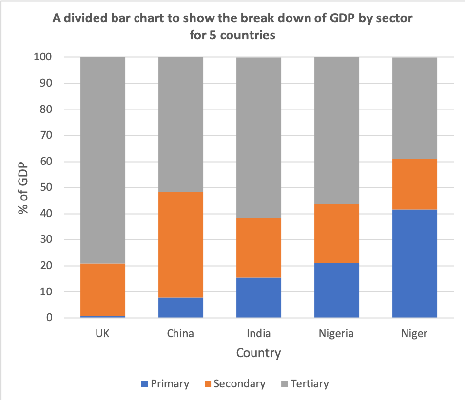
Creating a divided bar chart is relatively simple. In this example we are going to produce a divided bar chart to show the breakdown of GDP by economic sector of 5 countires. GDP measures the total value of all of the goods made, and services provided, during a specific period of time. The data below shows the GDP for five countries divded by economic sector:
- UK – Primary = 0.7% Secondary = 20.2% Tertiary = 79.2%
- China – Primary = 7.9% Secondary = 40.5% Tertiary = 51.6%
- India – Primary = 15.4% Secondary = 23% Tertiary = 61.5%
- Nigeria – Primary = 21.1% Secondary = 22.5% Tertiary = 56.4%
- Niger – Primary = 41.6% Secondary = 19.5% Tertiary = 38.7%
Step 1 – Decide on the scale of the X-axis
Decide on an appropriate scale on the X-axis for the bars.
Step 2 – Decide on the scale of the Y-axis
Decide on a suitable scale for the Y-axis. As the data is expressed in percentages then the y-axis must be between 0 and 100%.
Step 3 – Create the bar chart
Accurately draw the bars for each piece of data. Shade the different categories in the same colour and add a key.
Step 4 – Finish your graph
Include a title and label each axis.

Reading a divided bar chart
To read a divided bar chart, read along the x-axis (bottom) to find the bar you want. Then identify the category you want to measure and use the y-axis scale to extract the information.
Create your own divided bar chart
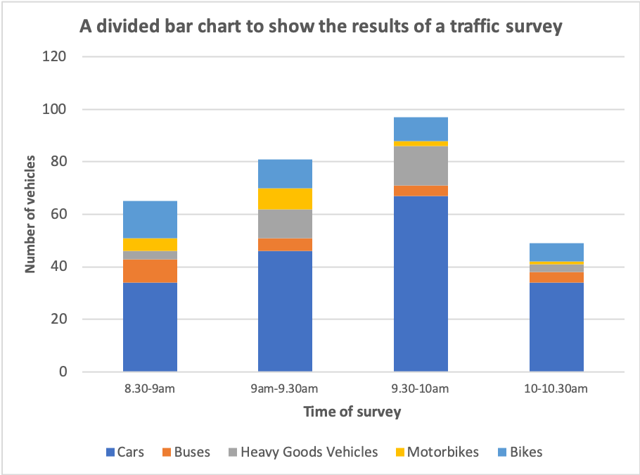
The data below shows the raw data from a traffic count. Present the data using a divided bar chart.
8.30-9am – Cars = 34, Buses = 9, Heavy Goods Vehicles = 3, Motorbikes = 5, Bikes = 14
9-9.30am – Cars = 46, Buses = 5, Heavy Goods Vehicles = 11, Motorbikes = 8, Bikes = 11
9.30-10am – Cars = 67, Buses = 4, Heavy Goods Vehicles = 15, Motorbikes = 2, Bikes = 9
10-10.30 – Cars = 34, Buses = 4, Heavy Goods Vehicles = 3, Motorbikes = 1, Bikes = 7
Download a divided bar chart template
Of course, divided bar charts are much easier to create using spreadsheet software such as Excel and Google Sheets. Download an example using the data shown above.
Data Presentation Techniques in Geography
Use the images below to explore related GeoTopics.


