Population Pyramids
The main population characteristics studied in geography are age and gender and typically involves using population pyramids.
What are population pyramids?
Population pyramids allow population structures to be presented in a way that makes the data easy to analyse and compare. They can be used to compare changes in the structure of the population over time. They allow governments and their agencies to project future population needs, such as health and education and put appropriate plans in place to meet these needs.
Population pyramids are split in half, showing males on the left and females on the right. The verticle axis is usually divided into 5-year intervals. The values along the x-axis can be raw numbers but are usually expressed as a percentage of the population. Below is an example of a population pyramid for the UK.
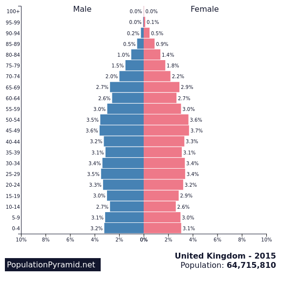
UK Population Pyramid – source https://www.populationpyramid.net/united-kingdom/2015/
Population pyramids vary in shape from country to country, depending on their level of economic development.
Population Pyramids in LICs
Population pyramids in low-income countries typically have a wide base and a narrow top. The population pyramid below shows the population structure for Kenya, an LIC. The narrow top indicates there are few elderly people, illustrating shorting life-expectancy. This suggests death rates are high which can be the result of poor healthcare and lack of sanitation.
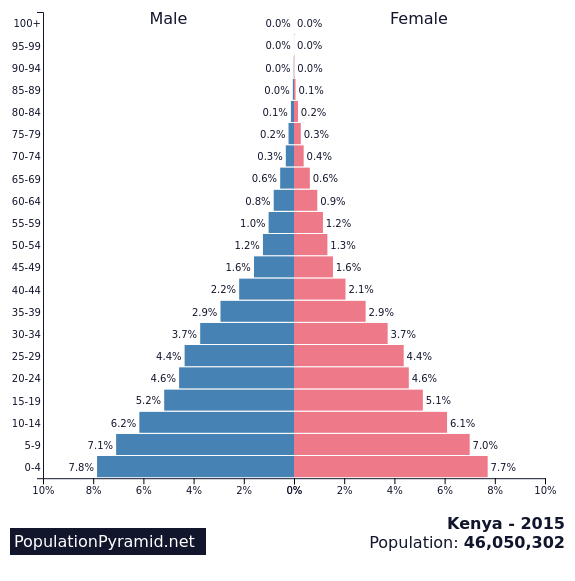
Population pyramid for Kenya
The wide base of the population pyramid shows a high birth rate and a youthful population.
Population Pyramids in HICs
Population pyramids in HICs are very different to LICs. They typically have a narrower base, indicating lower birth rates. There is also a wide central section showing a large working population. This is illustrated in the population pyramid for Japan below.
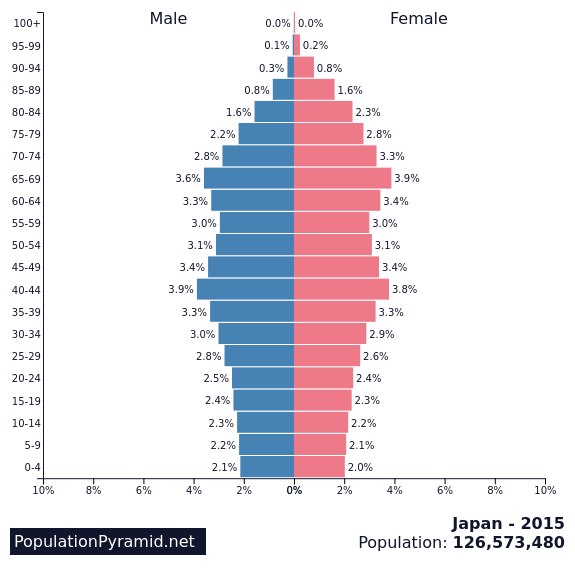
Japan’s Population Pyramid
The top of the population pyramid is also wider than a LIC because people are living longer due to improvements in health care creating an ageing population.
Population Pyramids in MICs
The population pyramid for India below is typical of a middle-income country (MIC). The wide base indicates birth rates are still quite high, mainly due to the tradition of having larger families in rural areas. The rapidly sloping sides above the age of 30 indicate that death rates were relatively high until fairly recently, due to the lack of health care available to people.
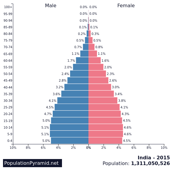
Population pyramid for India
The base of the population pyramid shows birth rates are falling and that the death rate has stabilised at a low level. The increasing proportion of elderly people (compared to the population pyramid for Kenya, an LIC), show death rates are falling and life expectancy is increasing.
The higher number of males compared to females illustrates the cultural preference for male children in India.
Population Pyramid Anomalies
Occasionally, population pyramids contain anomalies (differences that you might not expect to see). It is important to be able to explain anomalies in population pyramids. The population pyramid below shows the population structure of the population for Qatar. As you can see there is a significant anomaly in terms of the considerable bulge on the side of males between 20 and 59. This represents the foreign males who have migrated to Qatar to work in the oil and gas industry and construction.
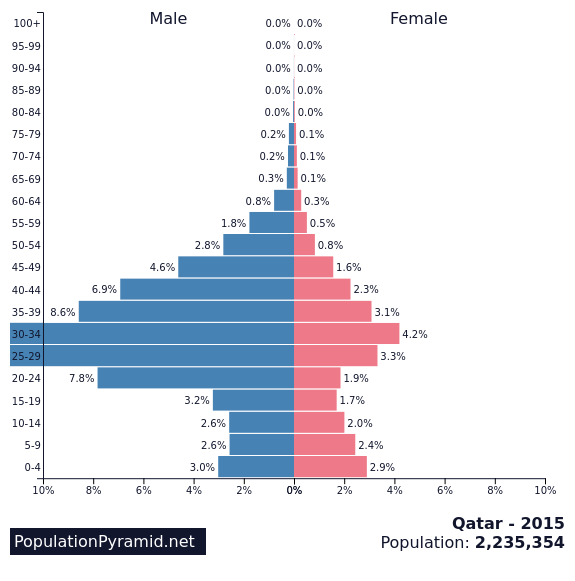
Population pyramid for Qatar
Related Topics
Use the images below to explore related GeoTopics.


