
Located Bar Charts in Geography
What is a located bar chart?
info
When is using a located bar chart appropriate?
info
Creating a located bar chart
info
Step 1 – here
Info
Step 2 – here
Info
Step 3 – here
info
Reading a located bar chart
info
Create your own located bar chart
Instructions
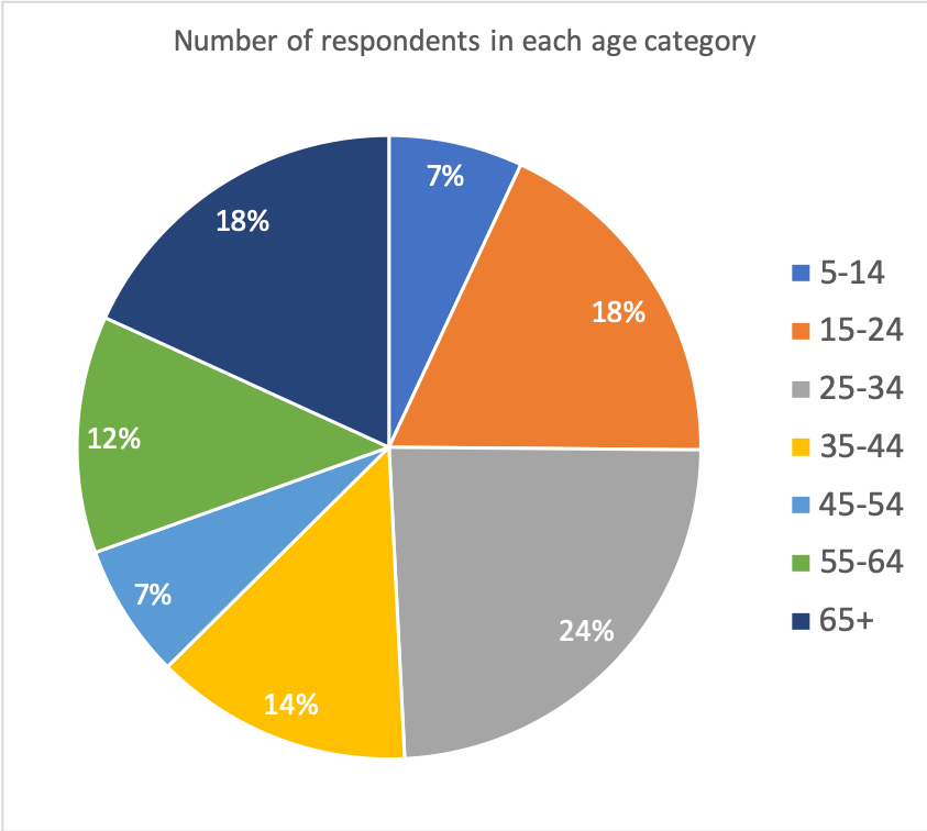
The data below shows the ages of people who were recently surveyed about hapinness in their local area. Create a pie chart to show the proportion of respondents in each age group.
5-14 = 13
15-24 = 34
25-34 = 45
35-44 = 25
45-54 = 13
55-64 = 23
65+ = 34
Answer
Download a located bar chart template
Located bar charts can be created using a range of software. Download an example using the data shown above.


Data Presentation Techniques in Geography
Use the images below to explore related GeoTopics.
Top Pages
Blog Posts
 Introduction to the AQA GCSE Geography Pre-release 20256 March 2025 - 11:38 am
- Santorini Shaken by Earthquake Swarm: Thousands Evacuate Amid Safety Fears6 February 2025 - 12:54 pm
- AQA GCSE Geography Case Studies and Examples Sheet22 January 2025 - 12:24 am
- GCSE Geography Summary Knowledge Organisers18 January 2025 - 11:32 am
- Wildfires in California: Causes, Effects, and Responses13 January 2025 - 11:46 am
- 2024: A Record Year for Wind Power10 January 2025 - 12:53 pm