Pictograms in Geography
What is a pictogram?
A pictogram is a way of presenting data using appropriate diagrams and symbols, drawn to scale.
When is using a pictogram appropriate?
A pictogram is an appropriate method of presenting discrete data when accuracy is not particularly important.
Creating a pictogram
Follow the steps below to create a pictogram.
Step 1 – Decide on the symbols
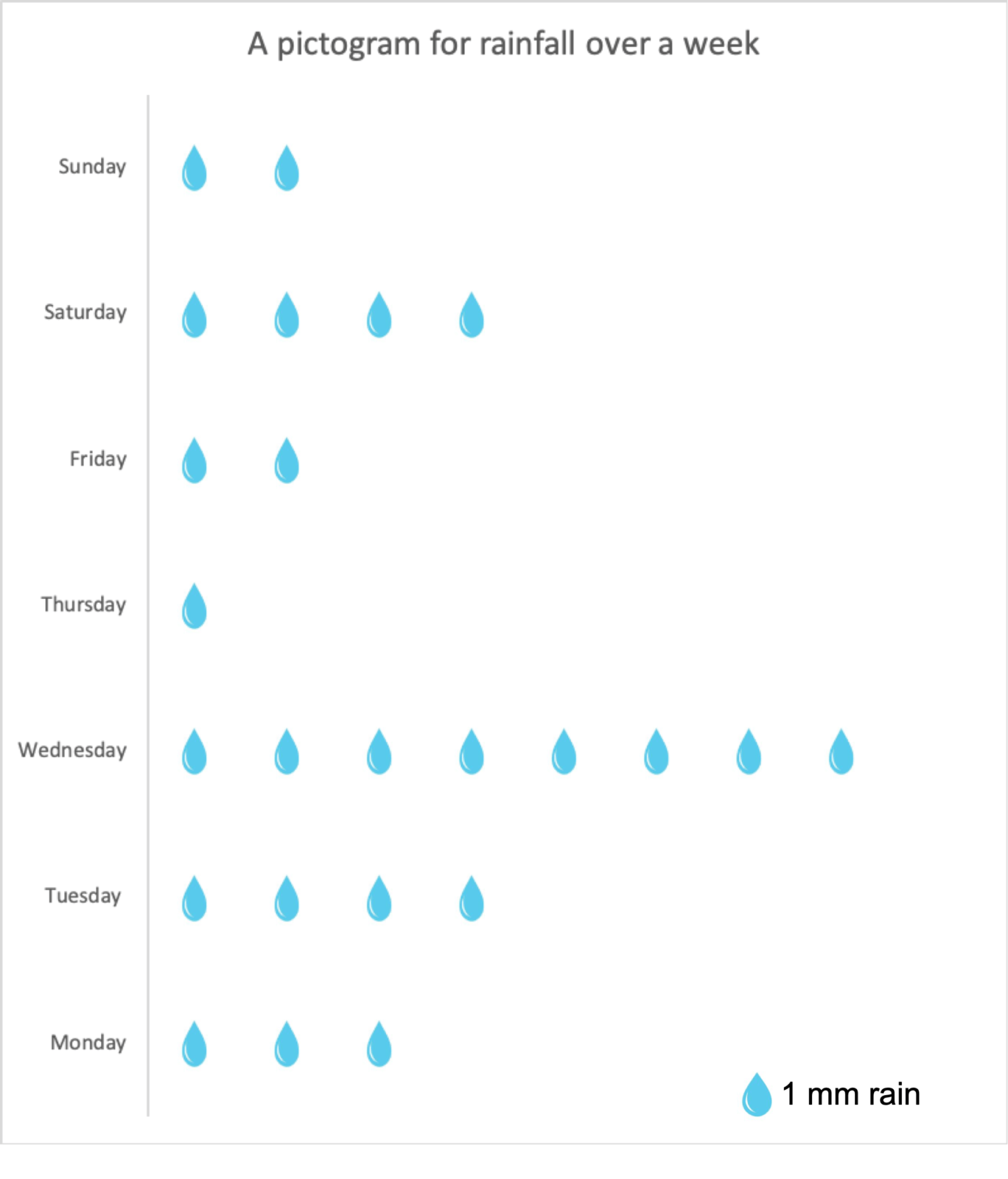
Decide on an appropriate symbol to represent your data. In this example, we will create a pictogram presenting the rainfall data below:
Monday – 3 mm
Tuesday – 4 mm
Wednesday – 8 mm
Thursday – 1 mm
Friday – 2 mm
Saturday – 4 mm
Sunday – 2 mm
In this case, we can use the shape of a water droplet.
Step 2 – Scale
Decide on the scale you will use for the symbols. In this case, we will use one droplet per 1 mm of rainfall.
Step 3 – Plotting your data
When creating a pictogram dates etc. do not have to be continuous. Draw the symbols. Sometimes the symbols will not be full-size if they represent a proportion of a unit. Remember to add a key, title and label the axis.
 Reading a pictogram
Read the title so see what the pictogram shows. Next, you need to look at the key to see what the symbols represent. Finally, read each set of data, you could write the figure for each data entry next to the symbols.
Create your own pictogram
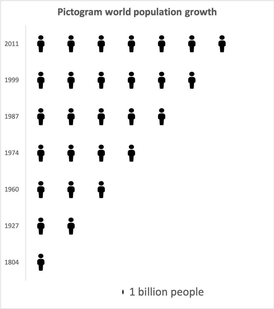
Create a pictogram to show world population milestones.
1804 – 1 billion
1927 – 2 billion
1960 – 3 billion
1974 – 4 billion
1987 – 5 billion
1999 – 6 billion
2011 – 7 billion
Download a pictogram template
Of course, pictograms are much easier to create using spreadsheet software such as Excel and Google Sheets. Download an example using the data shown above.
Data Presentation Techniques in Geography
Use the images below to explore related GeoTopics.


